Corporate Design
Eching
This logo reflects the well-maintained appearance of the municipality of Eching. The chosen color “green” represents the scenic atmosphere, while the water element represents the lake. I won first place for this logo in a Burke Academy competition.
The product:
A redesign of the logo and styleguide for the municipality of Eching.
Project duration:
April 2021 - December 2021
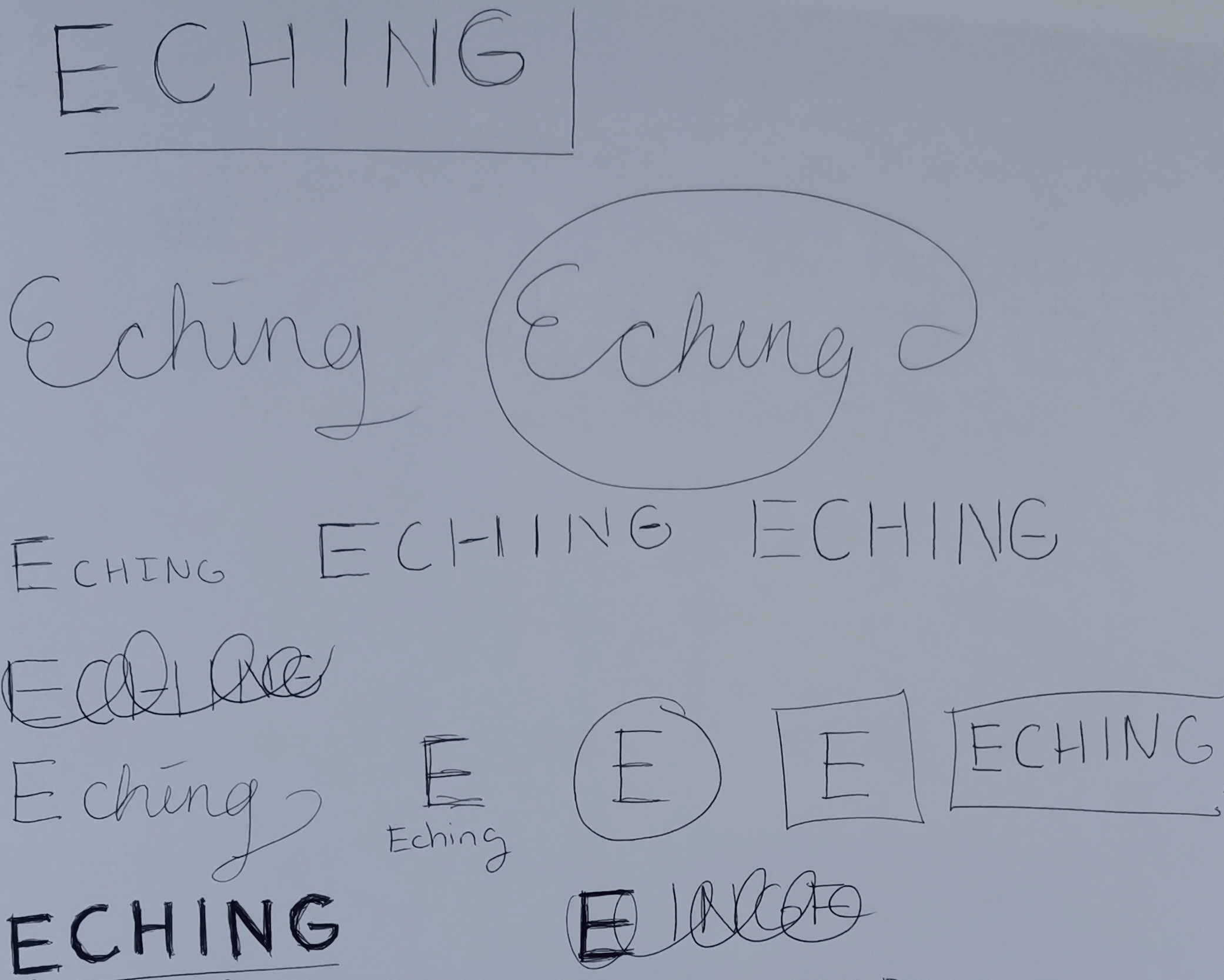
Sketches
In these sketches, I experimented with typography to explore different style directions between a handwritten look or a simple logo.
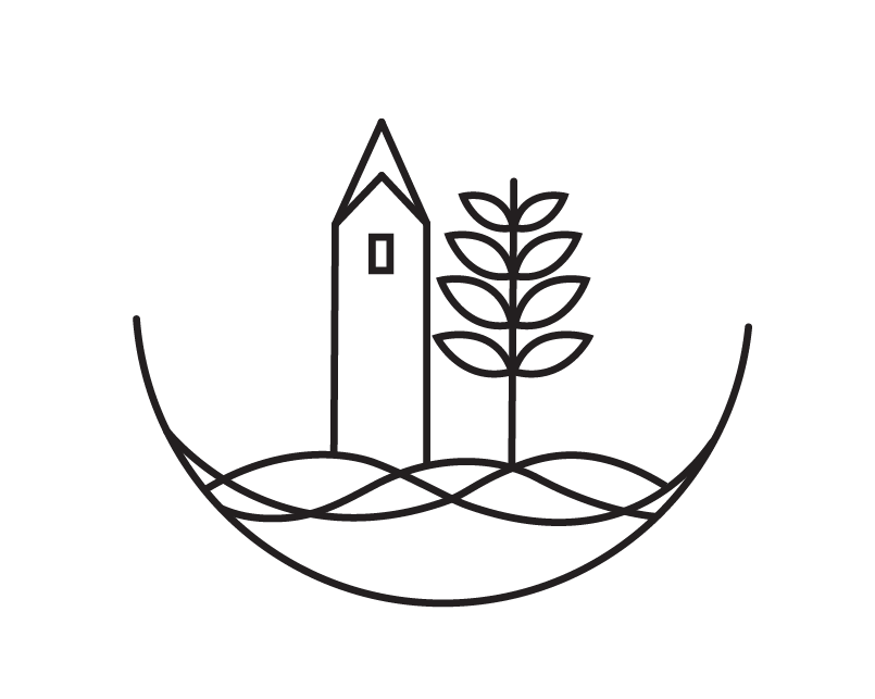
Element
This element was digitally created to represnt the city in one element. I combined the town main attractions, such as the church located near the town hall and the lake that is often visited.
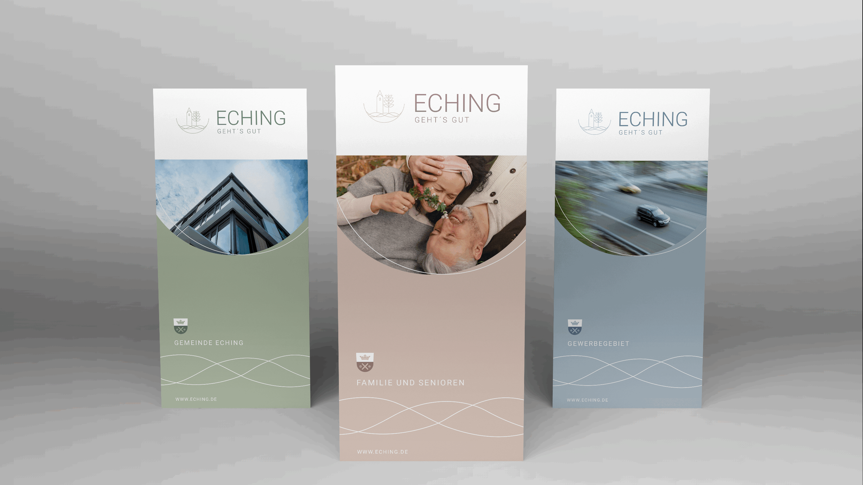
Final Design
A simple font style was chosen as it harmonizes with the element. The color palette sage green and white emits a friendly and welcoming atmosphere while also reflecting the modern aspects of the town.

Let's get in contact!
Thanks for visiting my portfolio! Feel free to send me an email at melissa.alley.design@gmail.com.